A CLOSE READ OF CURSOR.

Audit TypeBrand Experience
ScopeHomepage walk-through
DeliverablesStrategic audit + audio walkthrough
Cursor website
The Brief

Cursor was my gateway into vibe coding. I use it every day, and at some point I stopped thinking of it as a dev tool and started paying attention to it as a brand. The ocean painting, the warm palette by day, dark by night, even the decision to commission Cursor Gothic as a custom typeface. These are design choices, not defaults. That’s the kind of opinionated work I keep showing up for.

The walkthrough

Let me show you what I mean.

The homepage

Warm by day. Dark by night.

Most tech brands default to dark and call it a day. Cursor’s daytime palette lands warm, closer to Apple than a dev tool, and it shifts to dark after hours on its own. The one thing tugging at me: the product UI blends into the painting behind it. A stronger shadow would let the screen pop without losing the art. Drag the slider to see what I mean.

Cursor careers section, team collaborating at a whiteboard
1
Combine Changelog + Recent Highlights
2
Warm, welcoming photography. A nice layer of authenticity.
The photography

Warmth you can feel.

Cursor’s photography is doing quiet work. The careers shot: someone at a whiteboard, a real moment between teammates. Reads lived-in and expert at once. Tells you these people know their craft without saying it. Only one photo across the whole site felt off; the rest land in the same warm, considered register.

The moment it clicked

This is my favorite feature.

I was halfway through a landing page build when I realized I’d stopped thinking about the tool and started just working. The sidebar, the preview, the ocean painting still holding things together in the background. That’s what good product design does: it disappears. I typed exactly what I was feeling.

Cursor dark mode UI with heart-eyes emoji typed into the chat
1
My genuine, unprompted reaction
2
A landscape, earth-tone palette
On mobile

I checked it on my phone too.

Notes for the team
  • The auto day/night palette switch appears desktop-only. Mobile holds dark at 11am, no light version anywhere on the page.
  • Model picker dropdown overflows its container and covers the next section heading. Consistent across scroll positions.
  • The interactivity that makes the desktop homepage special (typeable demos, hover states) doesn’t carry over to mobile in the same way.
Cursor mobile — dark mode homepage
The audit

What’s working, what’s not, and what I’d love to help finish.

Cursor brand audit / 6 min listen

0:00--:--
Cursor ∗ Cursor ∗ Cursor ∗ Cursor ∗ Cursor ∗ Cursor ∗ Cursor ∗ Cursor ∗ Cursor ∗ Cursor ∗ Cursor ∗ Cursor ∗ Cursor ∗ Cursor ∗ Cursor ∗ Cursor ∗
What's Working

I keep coming back to what works.

01

Warm by day, dark by night.

Most tech brands force dark mode on you. Cursor went lighter, and it’s way more welcoming. It shifts to dark after hours on its own.

02

The typeable agent demo.

I accidentally realized I could type into it. That’s a product you can use right on the homepage.

03

The ocean painting.

It’s really different. It carries the whole visual identity and nothing about it feels stock.

04

The Mac-aware download.

It knows I’m on a Mac and serves the right CTA. Small thing, big signal.

05

The team photo on Careers.

More lifestyle than corporate — warm, welcoming product photography that adds a nice layer of authenticity.

Detail from the Cursor audit
[04]Opportunities

The parts I loved. The friction I hit. The list I’d ship.

05 Areas
01 / Opportunity

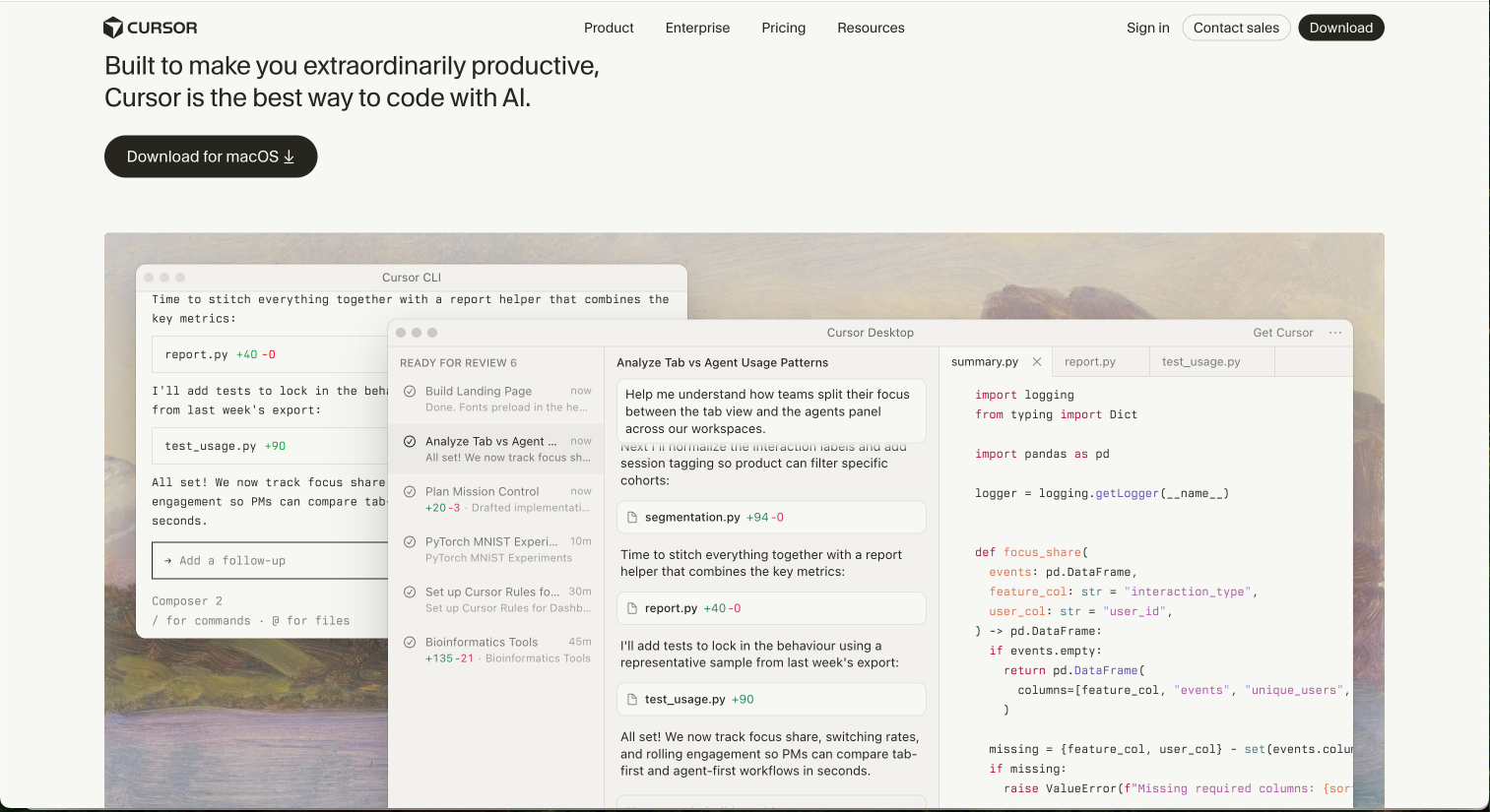
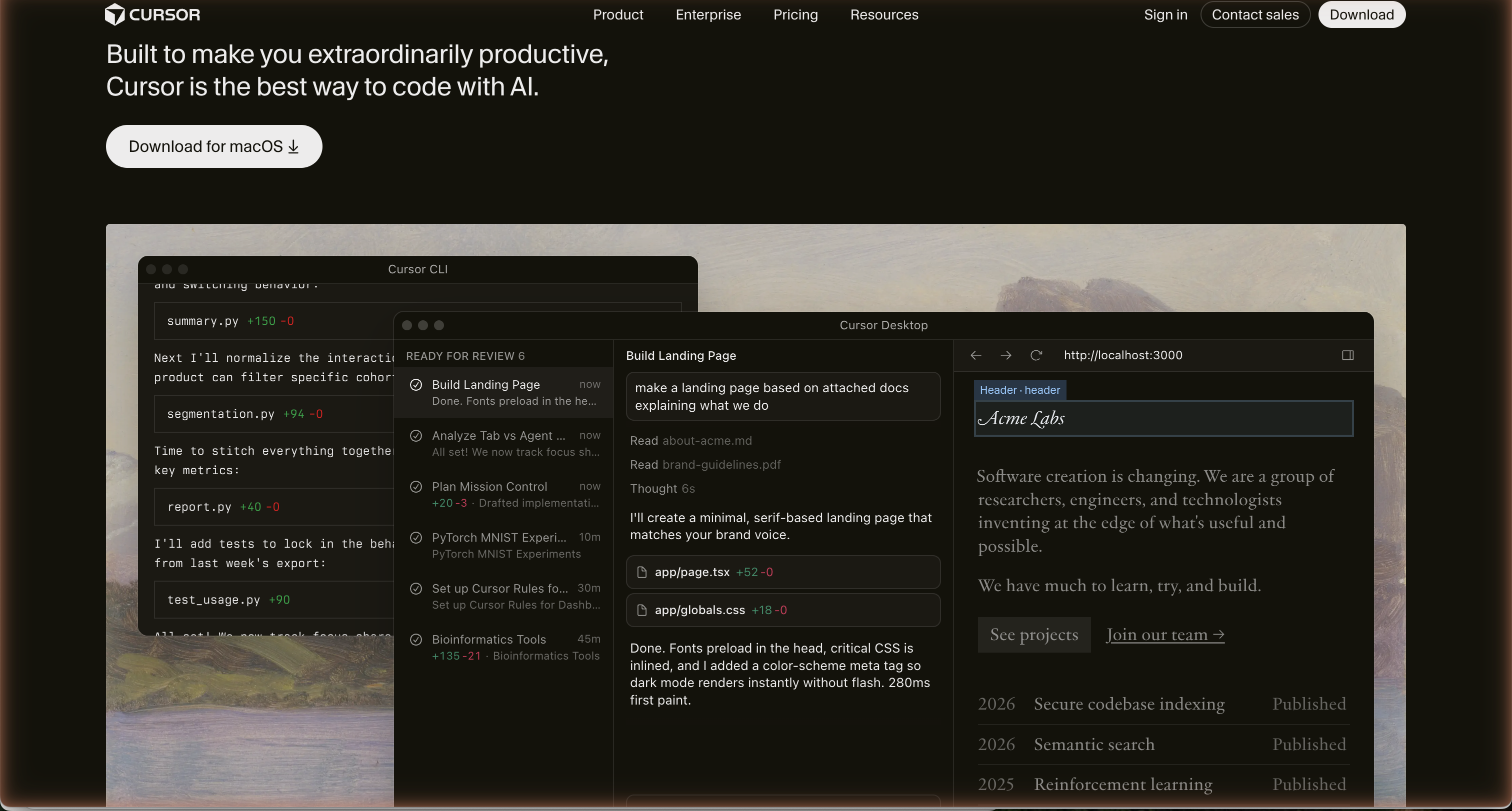
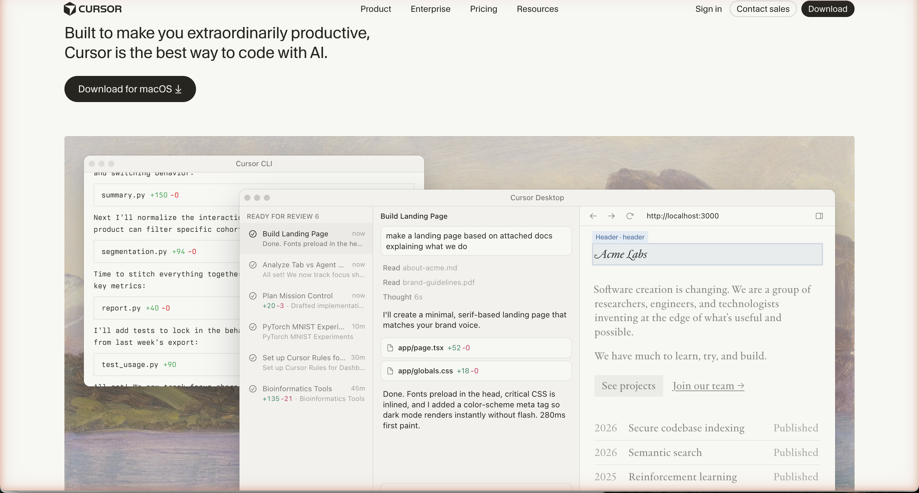
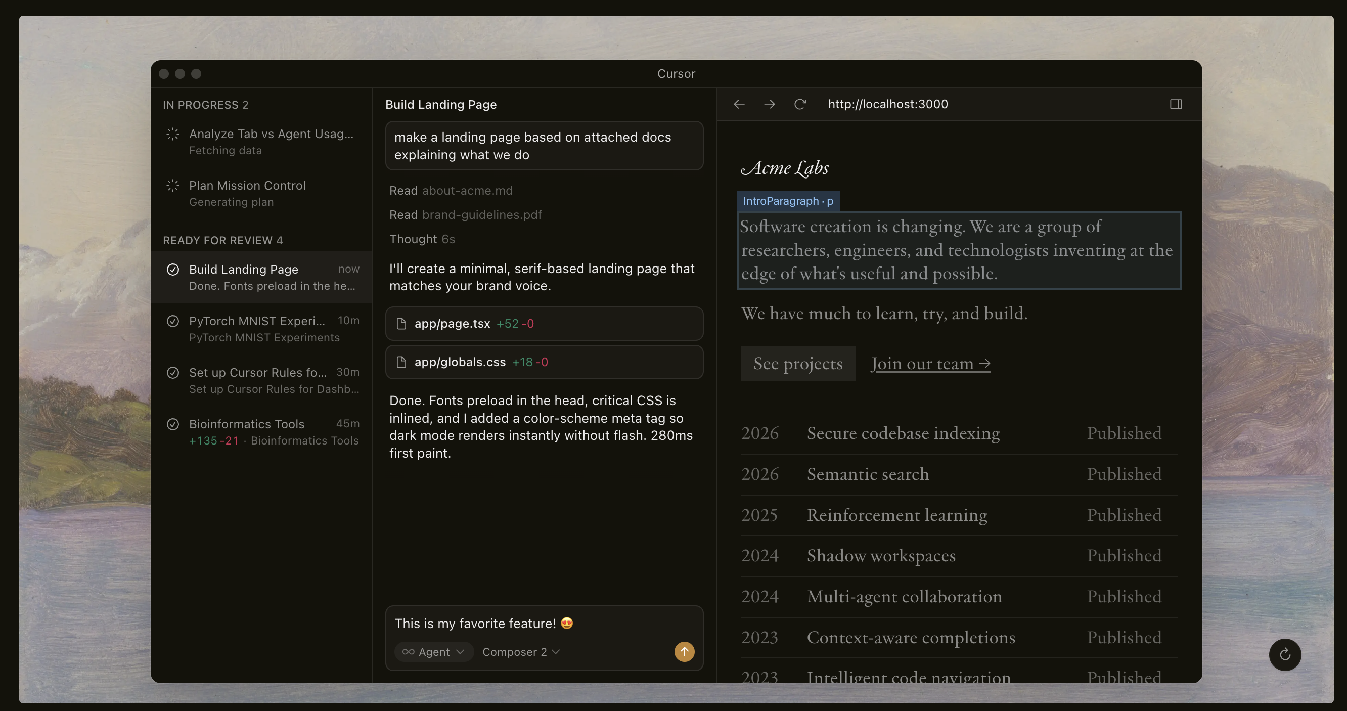
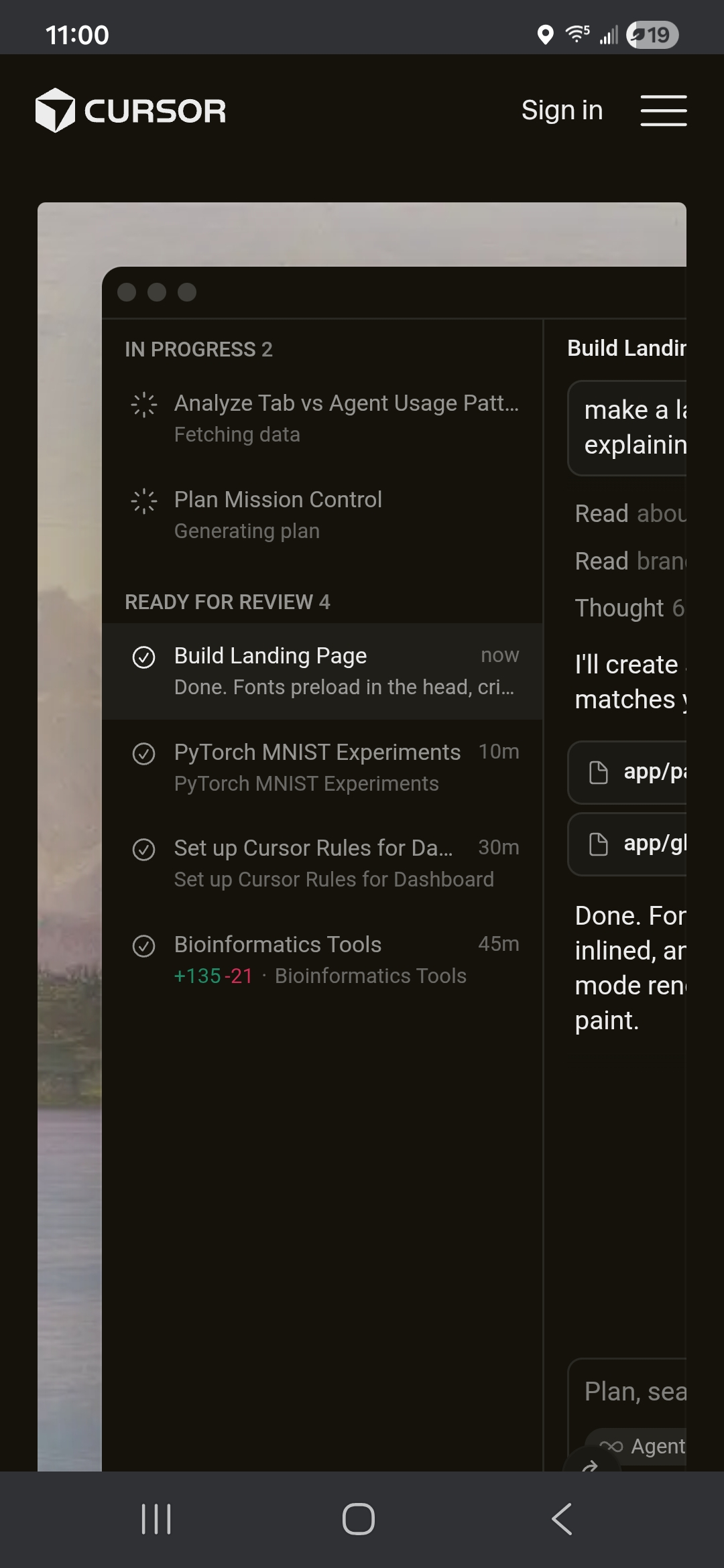
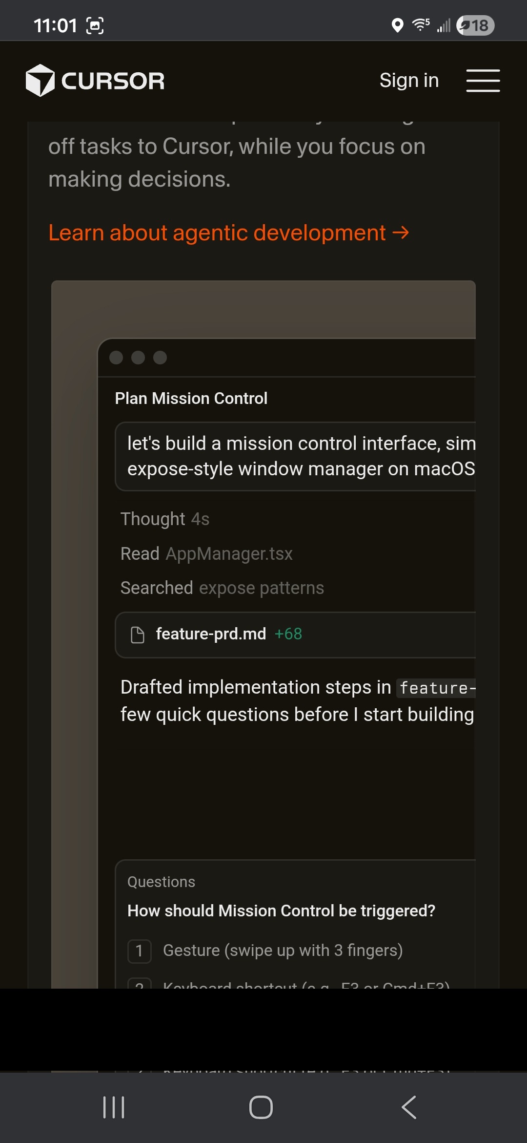
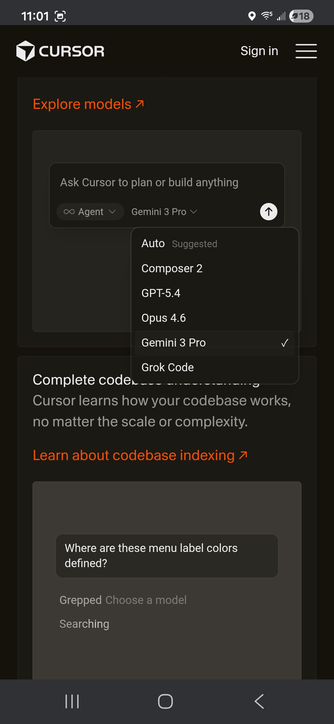
Signal the interaction

Cursor’s best moment is the typeable agent demo, and it’s near the top of the page. I still didn’t notice it on my first pass. The affordance is that quiet. A subtle hover cue, a blinking cursor, or a small ‘try it’ prompt would surface the interaction for people who’ll scroll past an unmarked one, without breaking the trust-the-audience vibe.

02 / Opportunity

One visual language

Most of the page commits to a specific palette: warm off-white, ocean blues, soft grays. Then the Enterprise section drops in a photo that doesn’t even match the Careers image two sections down. It breaks away from the visual language everywhere else is building. Re-grading it to the palette, or swapping for something that echoes the painting, would keep things continuous.

03 / Opportunity

Two surfaces, one job

Recent Highlights and Changelog use the exact same component and do the same job: telling the visitor what shipped. The blog posts already have great images in them. Pull those into the Highlights card, differentiate the layout from the Changelog, or combine them into one surface with a light taxonomy. Right now it reads like two teams solved the same problem.

04 / Opportunity

Let users override the clock

The auto day-to-night switch is thoughtful, but taste doesn’t always follow the sun. A persistent toggle would let the people who live in dark mode (or light) pick once and move on, without breaking the considered default for everyone else.

05 / Opportunity

Bring the quotes to life

The testimonial grid has strong names and strong quotes. But after all the interactivity at the top of the page, this section feels static. Even a subtle hover, pulling a card forward when you land on it or scaling up the photo, would keep the energy going. The rest of the page set a bar for interaction. This section should meet it.

THE STUDIO

YOU’RE BUILDING.

Cursor commissioned a custom typeface. Hired a Head of Design. Shipped a Design Mode. The investment in brand is obvious, and the homepage is the public face of a visual language that’s 80% formed. The ocean painting, the typeable demo, the warm-by-day bet: these are the bones of a brand choosing to look different on purpose. Closing that last 20% is exactly the work I love — if you’re building something worth finishing, that’s my favorite kind of project.

Quierra Wells

Quierra Wells

Design Director & Creative Technologist

View full profile
An outsider’s read

Let's talk.

Quierra Wells, Design Director & Creative Technologist. Happy to talk shop.